

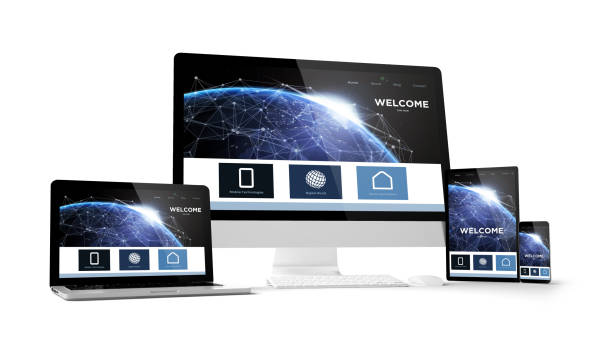
With users accessing websites across an endless variety of smartphones, tablets, and desktop monitors running diverse web browsers, maintaining a consistent layout is critical. Responsive web design and cross-browser compatibility ensure your digital platform renders flawlessly regardless of the user's chosen device or software environment.
To explore professional responsive web design and development services, visit Shuchit Infotek.
At Shuchit Infotek, we engineer fully responsive websites utilizing modern frameworks like Bootstrap 5 and fluid CSS layouts to guarantee uncompromised usability across all screens.
Core pillars of flawless responsive and cross-browser web design:
Fluid Grid Layouts: Utilizing flexible percentages and media queries so elements adapt proportionally to any screen dimension.
Cross-Browser Testing: Rigorously checking site performance across Chrome, Safari, Firefox, and Edge to eliminate rendering bugs.
Flexible Media Scaling: Ensuring images and embedded videos resize automatically without overflowing container boundaries.
Touch-Optimized Navigation: Designing interactive menus, buttons, and form fields that function seamlessly on mobile touchscreens.
How Shuchit Infotek optimizes your multi-device web presence:
Mobile-First Development: Building architectures from the ground up to prioritize smartphone user experience and speed.
Rigorous Quality Assurance: Testing every interface across multiple devices to ensure uniform performance and design integrity.
“Responsive design ensures your business is accessible to every user on any device,” state the web development experts at Shuchit Infotek Services. “We build adaptable web solutions engineered for universal reach.”
Your email address will not be published. Required fields are marked *